Jointly reported by:
Eugene Wong Zane Shaun Jr1Z(1)
Michael Ng Sr3A
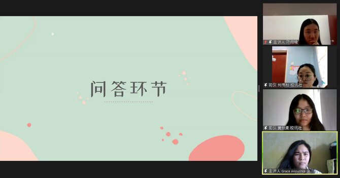
Ever wanted to design your own book? Kuen Cheng Newsletter Club has got you covered with their talk on magazine layout with InDesign held on Sunday, 30th May 2021, through the Zoom video platform. Guest speakers consist of layout directors from various school publications.
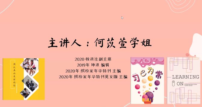
The first speaker was Ho Yi Xuan, who held many titles, such as the Vice President of the Newsletter Club and the Editor of the English edition of the “Learning On” Kuen Cheng News Bulletin.
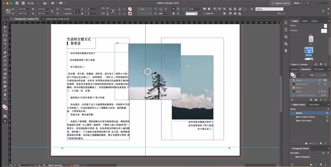
Her part of the talk was very demonstrational. Through a shared screen, she showed attendees how to set up their InDesign document, explaining various presets along the way. Once that’s done, she talked about adding and deleting pages, as well as changing their position and layout (i.e. detached or dual spread). Then, she showed attendees how to create guidelines for rows, columns, and gutters in-between.
Once the base setup was complete, Yi Xuan imported a text file into her program and moved onto textual layout. She showed attendees many ways to manipulate text and to overcome common issues like garbled text. She also taught us the technique of using the A-Master tool to standardise elements across all pages, for instance, page numbering.
Finally, she talked about her go-to websites for finding new fonts: http://www.xiazaiziti.com/tag/ttf for Chinese typefaces and https://www.dafont.com/ for English ones. One can also find inspirations on layout spreads on Pinterest. In a Q&A session right after the end of her talk, Yi Xuan mentioned that her favourite spread was that of Mr King Ban Hui’s. She also taught attendees how to overcome more technical difficulties in that session.
Phoon Mei Gi, the layout editor of “Dreams”, the 33rd edition of the Creative Writing Society’s annual literary magazine, was up next.
She began her section of the talk by introducing attendees to Photoshop. First, she explained how to use shortcut keys to remove items from images. She also taught participants how to change the settings of images which include colour, image size and resolution. She suggested that people should change the default resolution setting of 72 to 100 for digital books and 300 for physical books. Furthermore, she suggested using the TIFF image format when saving Photoshopped images.
Next, she taught the participants how to add photos into InDesign, as well as how to change the position and size of the photo. She also explained a set of symbols and what they mean. These included a yellow triangle, which represents that a picture has been tweaked; and a circle that represents that an image file has been deleted. Both issues can be fixed by simply clicking the symbols and relinking the files. On the note of linking files, she added that embedding links is not encouraged if one has up to a few hundred pages as the file size will be too big.
After that, she encourages one to save their files as a PDF if it will only be checked by teachers or teammates. When it comes to combining files or publishing, however, she encourages saving the file as a package. She ended her section with another Q&A, where she shared her experience of working in layout.
 Mei Gi inserting a picture into an InDesign document


