Jointly reported by:
Zhang Xi Yue JR1Z(6)
Ong Chen Xi JR2Z(2)
Sophia Ng Szu Fei Sr2ScB
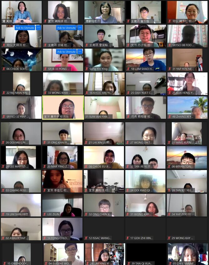
On the 14th of May 2021, the Co-curricular Department of Kuen Cheng High School jointly with the Newsletter Club, organized a talk featuring Mr King Ban Hui about layout and typesetting of digital books (also known as electronic books, e-books). This is to pique students’ and faculty members’ interests on the subject, and improve the average skill of typesetting in the School. The guest speaker is an artist as well as a writer who studied at the Kuala Lumpur College of Art (KLCA) and graduated from the National Taiwan Normal University (NTNU).
Before the main session with Mr King, the Vice President of the Newsletter Club, Chang Qian Hung, introduced e-books to the audience. He explained that the school had recently preferred them over paper-based books as they are more eco-friendly, easier to produce and share. Not only are their appearances identical to paper-based counterparts, but they also have many features that overcome the limitations of a printed book. For example, our School’s Annual Magazine, which can be viewed at the School Publication tab of our school website, showcase background music, images, and hyperlinks to other pages and websites.
Before ending his session, Qian Hung shared with the audience some of our digital albums and publications.
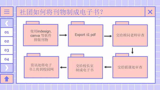 Kuen Cheng’s process of creating digital publications. After it is designed using software like Indesign or Canva,
it will be sent to be inspected and produced before being published by the IT department.
It was time for the main speech by Mr. King. To start off, he emphasized that the concepts of layout and typesetting are more important than knowing how to use the software themselves, hence his speech would focus on that topic.
Firstly, he talked about page margins and how spacing methods can produce different feelings for the reader. A book with wide line spacing will make the reader feel more comfortable, while one with very little spacing can give off an exciting or nervous feeling. It should be important to note that if the page margin is too small, it would be harder to read the words because they would be tucked into the spine of a book.
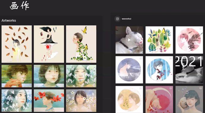
He explained how the choosing, insertion or layout of images must follow some principles of art as they can decide the atmosphere of any given publication. Although pictures can break up the monotony and tell a story just as effectively as words, it is important that we use them wisely. An attractive image should be the highlight of your publication, while a gallery of similar-looking images can make it look like a story is taking place. Meanwhile, illustrations can give a more lighthearted or authentic feel.
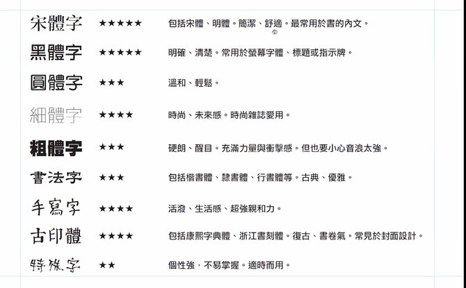
After Mr King’s helpful explanation on pictures, he talked about the effects of fonts. Different publications prioritise different moods, like how comfort is the key to publishing a book or magazine. The choice of fonts varies across different genres. Bold texts could be used to attract people’s attention, while a neat font can give a calm and comfortable feel and hence are better for novels and magazines.
Then, he proceeded to explain how different types of layouts suit different kinds of reading materials. He highlighted the importance of balancing text, images and colour. For example, one page can be made of colourful images while the other page can be composed entirely of text. Other than that, many tools such as lines or colour blocks can be used to divide up blocks of text and guide the reader’s attention.
Lastly, he gave his opinions on our school magazines. Unfortunately, he was only able to look at some due to the time constraint, but he still gave his whole-hearted views on the e-books published last year and was glad to see improvements made by the students. He commented on each of them, and particularly liked the English books’ use of comics. Regardless, he still advised them to strive harder by working on their layout.
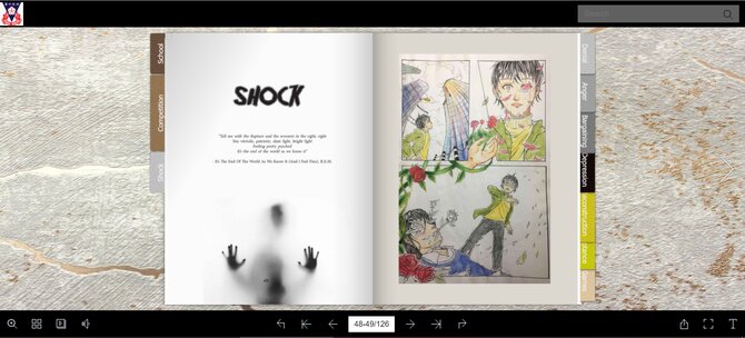 The “Shock” comic in the English News Magazine
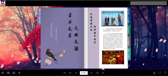 A spread from the Chinese News Publication by the Newsletter Club

